Role
Deliverables
Vendor Profile Pages
A project aimed at improving organic visibility and building user trust by creating dedicated, SEO-optimized pages for major parking vendors on Way.com.
Despite having hundreds of vendor partnerships, Way.com lacked public-facing vendor-specific pages.
Vendor details were buried deep within the booking flow.
Search engines couldn’t index vendor-level information, limiting Way’s organic reach.
Users searching for terms like “Icon Parking San Diego Way.com” or “SP Plus parking Chicago” were being directed to competitors instead.
This design challenge was clear:
“How might we build SEO-friendly, informative, and conversion-focused vendor pages that help users find what they’re searching for - while strengthening vendor trust and visibility on Way.com?”
Create a dedicated static page for every major city vendor.
Optimize these pages for both SEO ranking and booking conversions.
Position vendors as trusted partners through design and credibility cues.
Use these pages as landing pages for Google Ads, organic search, and email campaigns.
I designed a scalable Vendor Page Template, a consistent yet flexible layout that could auto-populate vendor data while maintaining brand alignment and UX consistency.
The page was designed to balance three core needs:
User clarity → easy access to information, trust indicators, and booking options.
Vendor credibility → highlighting partnerships, reviews, and operational scope.
Business performance → improving SEO discoverability and conversion rate.
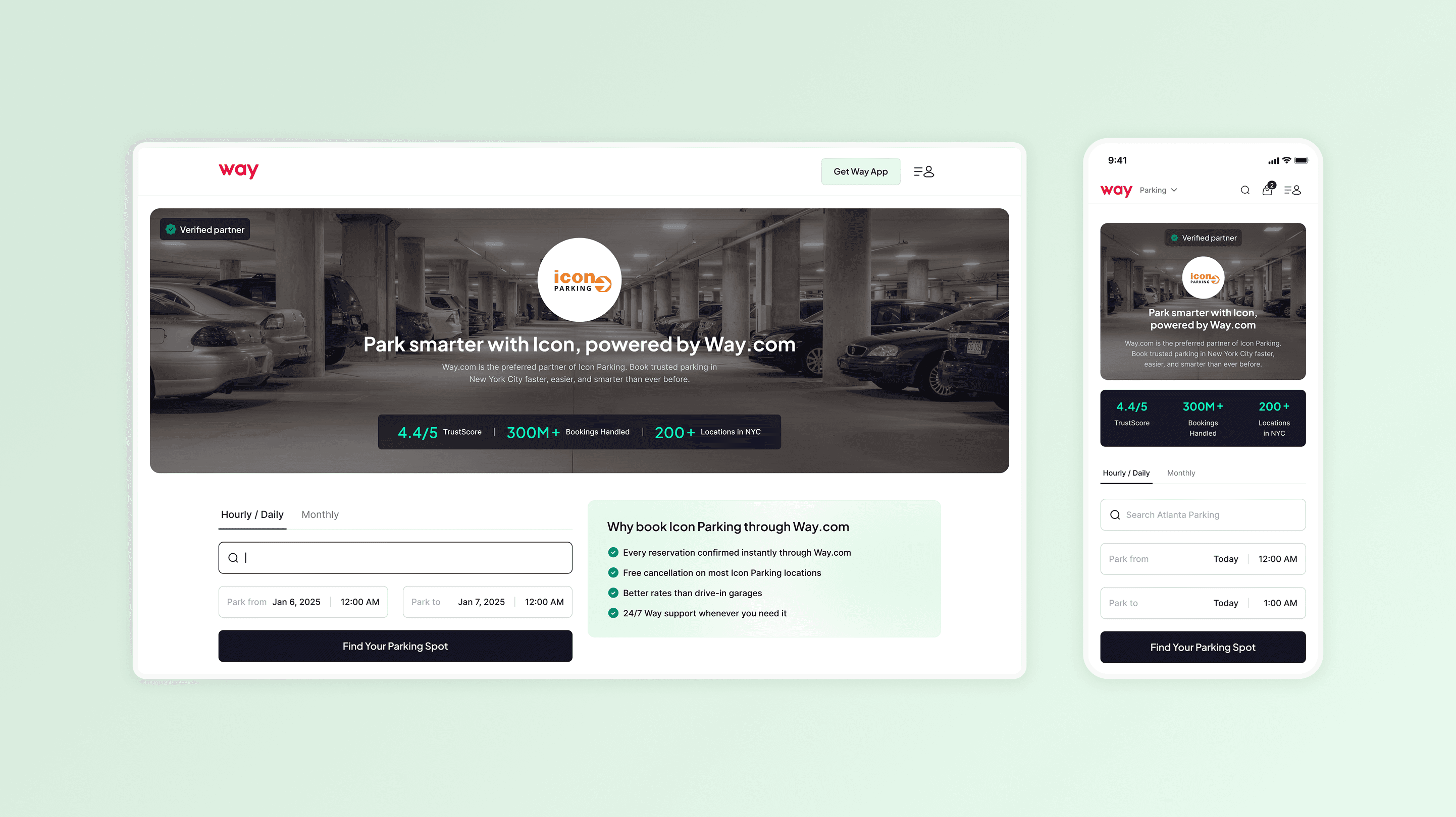
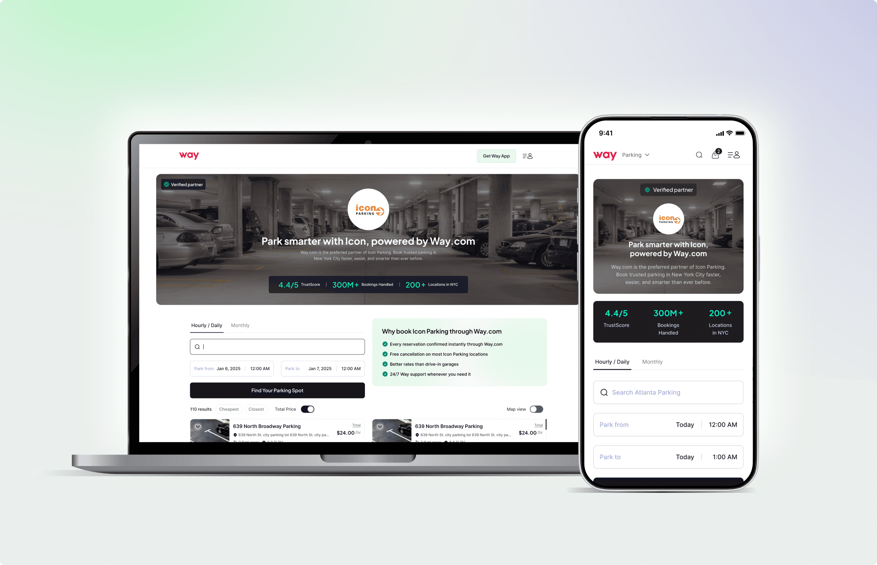
1. Vendor Overview Section - Building Trust Instantly
Prominent vendor name, logo, and “Verified Partner with Way” badge.
Quick facts: years in operation, partner since {year}, cities served.
Clean, above-the-fold layout with a sticky “Find Your Parking Spot” CTA.
User impact
Visitors immediately recognize the vendor’s authenticity and relationship with Way, reducing uncertainty about booking through a third-party platform.
2. Search field & Booking CTA
The search field is placed prominently in the first fold on both desktop and mobile web, prioritizing the primary action users come here for.
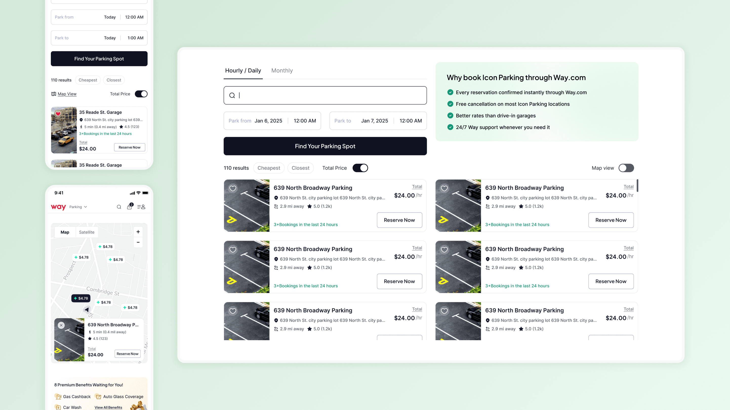
3. Map View & List View
Seamlessly switch between map view and list view as per the users convenience
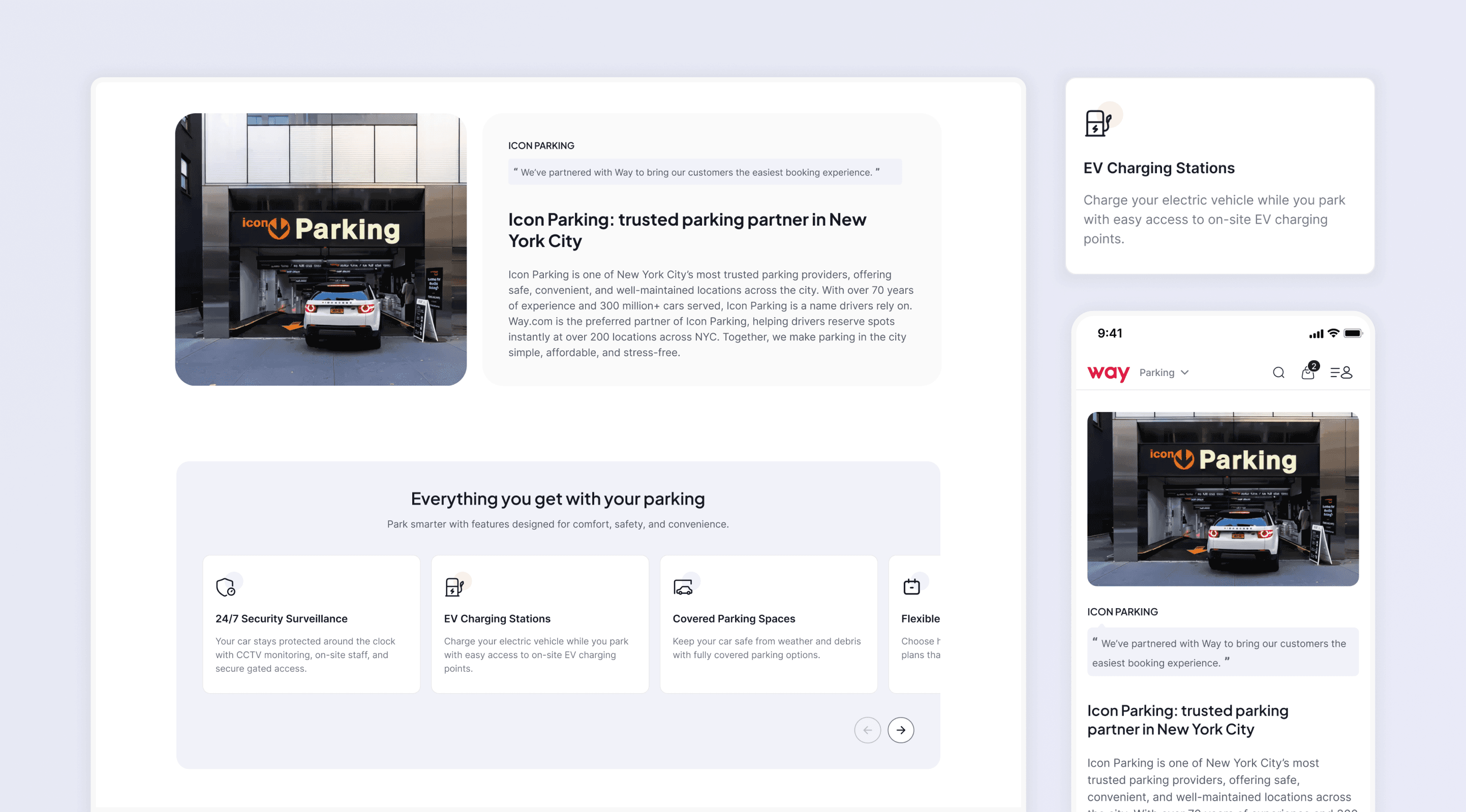
4. Detailed Vendor Information Midway
Displays key amenities (EV charging, valet, covered parking, ADA access).
Presents information of credibile service

Testimonials & Reviews - Social Proof at a Glance
Highlights top 2–3 real customer reviews from lots managed by the vendor.
Displays star rating, user initials, and “Read All Reviews” link.
Linking to Way’s main listings page
If the user doesn’t find a suiting option here, then we are linking the user to way’s other listings available and taking the user to our main listing page
Users will find value in this as we are presenting them with multiple options.
Through this project, I learned how design can bridge the gap between what users search for and what the business needs to surface. It reinforced the importance of combining UX thinking with SEO strategy to create experiences that feel trustworthy, helpful, and genuinely valuable.


