Role
Deliverables
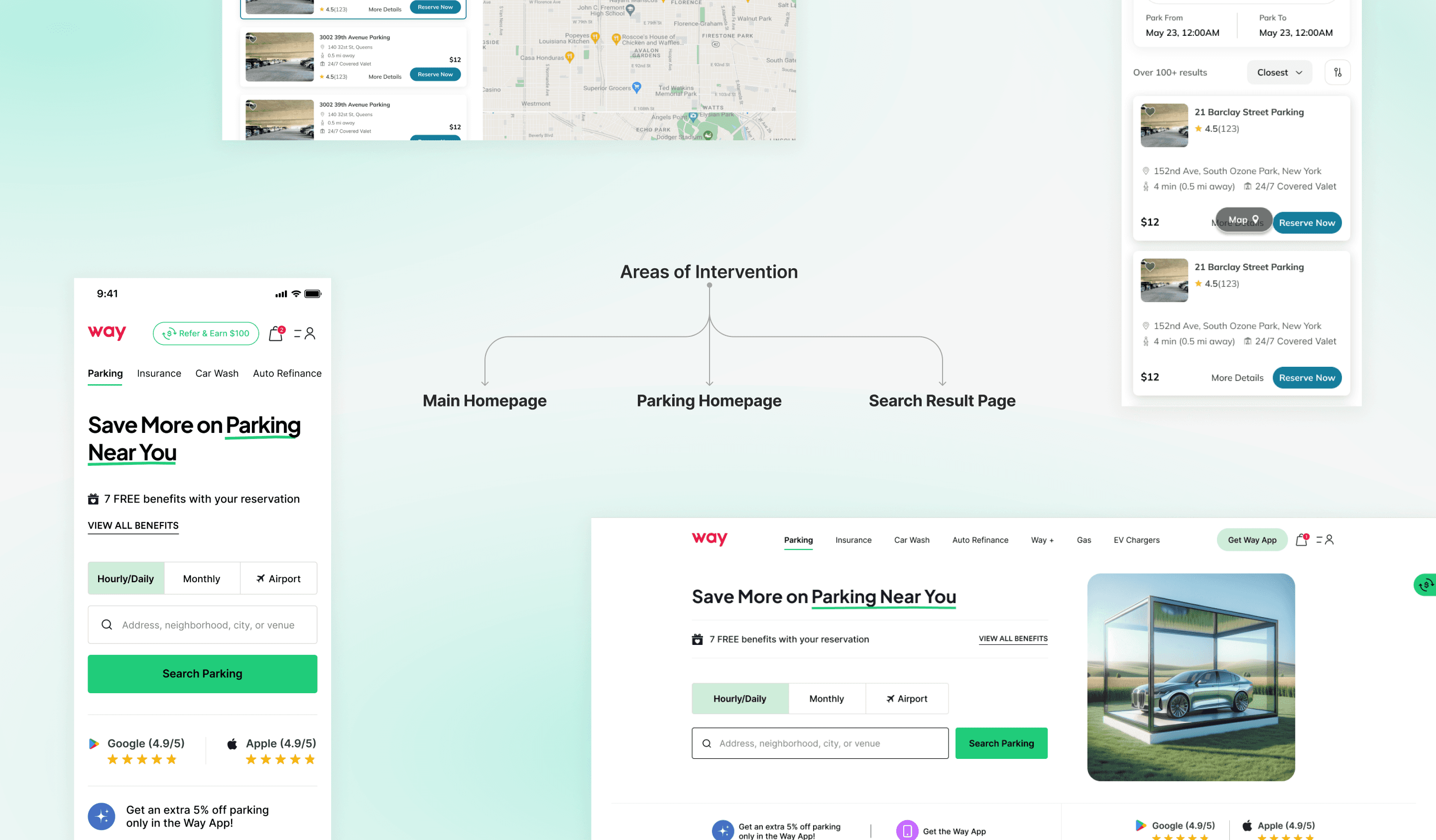
Converting Web Traffic to App Users
The goal was to increase Way app installs among web users by introducing strategic, visually engaging, and action-oriented banners across the user journey.
While Way’s web platform was performing well in attracting new visitors, a large portion of users completed their bookings on desktop or mobile web, missing the long-term engagement benefits that come from app usage - like modifying bookings, savings through way wallet, discounts & benefits.
Through behavioral insights and analytics, we discovered that:
Users visiting the site for the first time often lacked awareness of the app’s exclusive benefits. Even after completing a booking, most users didn’t transition to the app ecosystem.
This led to the design goal:
“How might we encourage users to download and engage with the Way app - without interrupting their booking flow?”
To influence user behavior naturally, contextual app promotion banners were introduced throughout the web journey—strategically placed at moments when user intent is highest (during search or booking) or satisfaction peaks (after purchase).
Each UI element was designed to:
Show immediate value: Highlight rewards like modifying bookings, savings through way wallet, discounts & benefits.
Prompt action: Use clear CTAs such as “Download & Claim ₹100” instead of passive phrases.
Reinforce brand trust: Maintain visual consistency with Way’s design language and app identity.
Stay non-intrusive: Load lightly and avoid blocking key interactions.
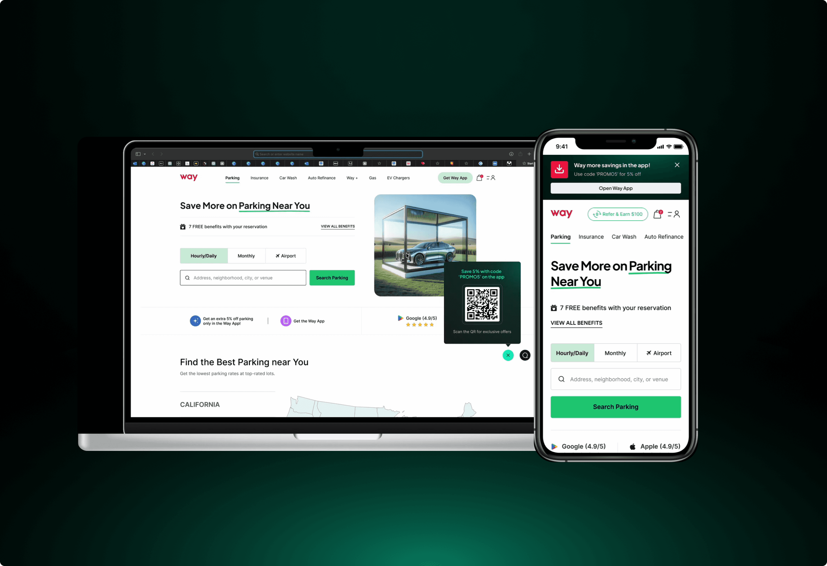
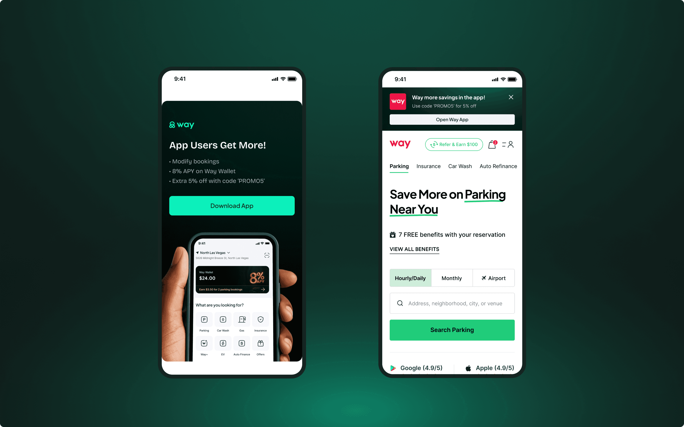
Homepage
The Placement of banners and nudge here has been done above the fold and mid-homepage on both desktop and mobile to introduce app benefits early and build curiosity and perceived value.
Design Highlights:
web
Floating Action Button with an interactive banner and CTA.
Animated banner to grab attention as the users scroll.
UX copy that educates and prompts the user to take action.
Mobile
Banner above the top navigation bar with download app animation.
Floating Action Button with animation that appears as the user scrolls down the first fold
Animated banner to grab attention as the users scroll.
UX copy that educates and prompts the user to take action.
At this stage, users become aware that booking via the app offers real, immediate benefits. It subtly shifts perception—from “just another parking website” to a “smart savings platform.”
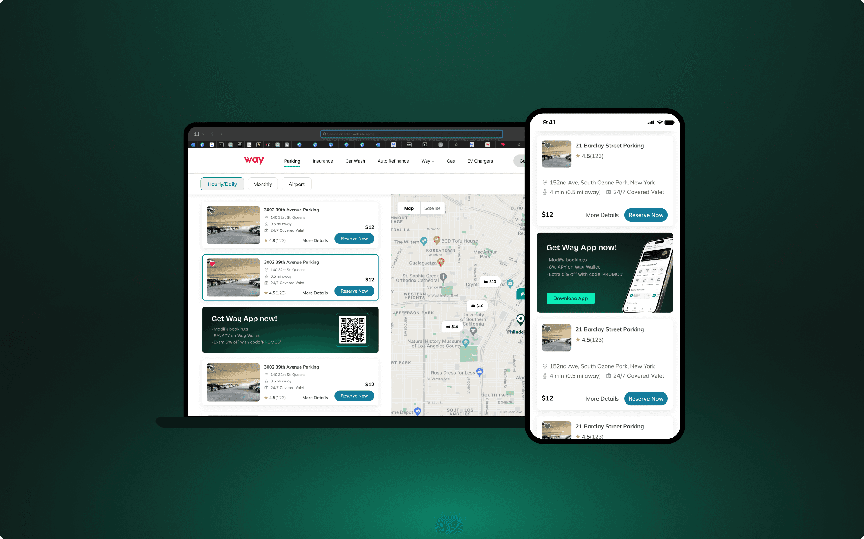
Search Results/Listing Page
Here the area of interventions are above the fold and as inline banner cards, this placement aims to reinforce the app’s value at a moment of high user intent.
Design Highlights:
web
Floating Action Button with an interactive banner and CTA.
Card style banner placed in between 4th & 5th listing cards.
Mobile
Banner above the top navigation bar with download app animation.
Card style banner placed in between 4th & 5th listing cards.
At this point, users already browsing parking options see downloading the app as a way to save instantly, encouraging spontaneous action without leaving the page.
Post-Purchase Integration
In the post-purchase flow (confirmation screen, emails), banners and prompts will remind users of their reward credit available on the app - creating a habit loop that encourages repeat bookings through mobile.
↑ 12% increase in app downloads from web visitors within the first month.
↓ 11% reduction in user drop-offs between search and checkout.
↑ 19% engagement with in-app booking after install (repeat usage).
This project taught me how strategic UX messaging and contextual design can influence user habits and drive measurable business outcomes. Rather than forcing conversion, the design approach guided users gently through awareness, motivation, and action, creating a more rewarding relationship between the user and the product.


